
Casual California: A Conversation with Dean Torrence
By Mark A. Moore
Author of Dead Man’s Curve: The Rock ‘n’ Roll Life of Jan Berry
In Jan & Dean’s heyday, from the late 1950s to mid-1960s, Rock ‘n Roll artists did not have full control over their public imagery, as packaged by production companies or record labels. Yet while signed to Doré Records between 1959 and 1961—before Surf Music came to prominence—some of the duo’s earliest public imagery and press coverage tied them to Southern California’s beach culture.

With their first national television appearances in 1959, Jan & Dean presented a characteristically West Coast look and style—tall and blonde, with distinctive haircuts, slacks, loafers, and matching sweaters or jackets. They could also transition to a quirkier look. With outré panache, as young female fans shrieked and swooned, the duo took to the stage in Bermuda shorts, V-design sweaters, and dark-colored knee high socks. On August 30, 1959, they performed as part of a multi-artist lineup for a sell-out crowd of 30,000 at the Hollywood Bowl. “Mass hysteria reigned throughout the entire evening,” reported the Los Angeles Times. “So constant and deafening were the screams that it was difficult to hear the performers. The air crackled with excitement. . . . Jan and Dean, in their Bermuda shorts, brought about pandemonium.” Visually, they posed a new and striking contrast to East Coast crooners of the day.

After Doré, beginning with their brief tenure on Challenge Records, the duo worked under a more rigid corporate structure with Nevins-Kirshner Associates (September 1961) and its successor Screen Gems-Columbia Music (April 1963). They were signed to these New York-based production companies as artists, and Jan Berry was signed in separate capacities as a songwriter and record producer. Nevins-Kirshner brokered Jan & Dean’s recording contract with Liberty Records in the fall of 1961, which would be home base for the next five years. Screen Gems took over in the spring of ‘63 and oversaw all aspects of the duo’s recording career during their biggest hit-making years. Liberty paid Screen Gems a royalty for the privilege of manufacturing and releasing Jan & Dean’s recordings. Their manager Lou Adler headed the West Coast offices for both production companies (one succeeded the other), located at 6515 Sunset Boulevard in Hollywood, where Jan’s contracts with Screen Gems made him a professional peer of the Brill Building songwriters.

Lots of perks came with working for a major music corporation with ties to the film industry, but it didn’t take long for Jan to begin chaffing under the far-reaching control of the mother company.
![]()
Grammy Award-winning artist Dean Torrence had been a talented graphic designer from the beginning. After returning to Los Angeles from a stint in the U.S. Army Reserve in September 1958, Dean enrolled at Santa Monica City College before transferring to the University of Southern California, where he majored in advertising design.

Early on Dean designed the disc labels for Jan’s solo single “Tommorrow’s Teardrops” (Ripple 1961) and the custom imprint Festoon Records. Jan created Festoon in February 1963 for release of his production of “Come On Baby” / “Just For Tonight” by Judy & Jill—Jan & Dean’s girlfriends, Judy Lovejoy and Jill Gibson. The Festoon disc featured some of Dean’s classic hand lettering and a sign motif with reference to “J&D,” a design that would have been right at home at Dean’s Kittyhawk Graphics firm a few years later.

By late 1965 and early ’66 Dean had made some inroads toward contributing to the official design and packaging for Jan & Dean’s album covers, only to see the opportunity fall by the wayside when Jan’s car accident ended everything in April 1966. But what of their album covers and single picture sleeves between 1959 and 1966? I asked Dean to share some insight on the duo’s overall style and public imagery:
Mark A. Moore: Your early public appearances generated some classic footage. Did you and Jan have any influences in choosing your look for the early television and concert appearances? I’m thinking of the striped sweaters, the V-design sweaters, and the jackets with thin vertical stripes. The vaudevillian shtick for the Dick Clark performance of “Julie” was something different.
Dean O. Torence: Most of the ‘50s and early ‘60s clothing decisions were made by Jan or Lou Adler. Lou liked the tailored suits look (teen idols) and Jan liked the matching sweaters and shorts attire.
I was the newbie so I was just happy to be there. I had no real opinion, anyway.

MM: Doré Records (pronounced like “Dorrie”) was headquartered on Vine Street at Sunset Boulevard in Hollywood, across from Wallichs Music City, part of L.A.’s “Record Row” of independents. Radio veteran Jim Pewter, who first met Jan in Hollywood in 1959, told me Doré president Lew Bedell hoisted a huge poster of Jan & Dean outside the label office when “Baby Talk” hit it big. Pedestrians and passing motorists couldn’t miss it. Do you remember that? It would be interesting to know who designed it, and who was contracted to create it.
DT: I don’t remember that at all, but if that were actually done, I would be more inclined to think that it was Lou’s idea.

MM: I’ve always liked the packaging for your first album—Jan & Dean, March 1960—printed by Container-Kraft, which was located on East 61st Street in L.A. Gene Lester designed the front cover. The rear cover photos by Eddie Colbert are significant. They’re among the earliest images showing you and Jan in a studio setting. You’re pictured with managers and producers Lou Adler and Herb Alpert, and engineer Don Blake. There’s even a shot showing a couple of musicians, likely including Rene Hall. Do you remember which studio those images were taken in? Was the large full-color photo insert unique for LP packaging in that era?
DT: Maybe Radio Recorders, a very low-tech recording studio, as I remember. I don’t remember ever seeing a poster insert before ours. I am pretty sure that was our idea.


MM: In May 1960 the full-color picture sleeve for “We Go Together” was the first label-related imagery tying you and Jan to Southern California’s beach culture. This of course was long before the Beach Boys arrived on the scene. The photo showed you and Jan at the beach with your girlfriends, dressed in plaid shirts and light-colored shorts, with waves crashing on the rocks in the background. You both surfed and spent a lot of time at State Beach and similar locations. Jan & Dean headlined a “Safari Swing” at the Bel Air Bay Club in Pacific Palisades in June 1960. In describing this event the Los Angeles Times explained the allure of the beach in Southern California: “Cool ocean breezes, the foamy surging of the surf, the sun on the warm sand and school doors closing for the summer are too much of a lure to society’s young set . . . so the exodus to the beaches is the inevitable sign that summer is really here. . . . And key to all the merriment, the togs in which everyone will arrive [for the show]—Bermudas, surfers and pith helmets.” Did Doré pick up on similar instances, to the point they would choose that imagery for “We Go Together”? How did that come about? Did Herb and Lou have any input on that?
DT: Doré Records would have never had that kind of vision. I’m pretty sure that was a Jan, Dean, and Lou decision. Jan and I picked the location, “Castle Rock,” just a little north of the very busy State Beach. We also wore our own street clothes, which was a first.

MM: In October 1960 the cover of Movie Teen Illustrated magazine showed you and Jan at La Costa Beach in Malibu, wearing Ivy League shirts and surrounded by four girls. You both arrived for the spread in a white ragtop T-Bird. And aside from photos, the entertainment rags also began tying you and Jan to the sport of surfing, and to a love of cars and drag racing. In March 1961 Hit Parader magazine noted that “Jan enjoys surfing at the beach in his spare time; and he also spends a good deal of time experimenting with over four thousand dollars’ worth of recording equipment that he has accumulated. . . . Dean, the sports car enthusiast of the duo, drives a 1960 Corvette, and can frequently be found at the nearest drag race in his spare time. He also enjoys surfing. . . . Both boys enjoy the casual California living.” In the summer of ’61 Song Hits magazine observed that “Jan also finds time to romp in the surf at Malibu Beach.” They were describing your everyday lifestyles, but surfing and drag racing would soon become the basis for vocal Surf and Hot Rod music. Surf culture was deeply ingrained in Southern California by that time, and even got its own media coverage. John Severson’s Surfer magazine debuted in 1960 and Rick Griffin’s “Murphy” comics began running in the magazine in ’61. John Van Hamersveld joined the staff as art editor. The Surf Music instrumental genre took off in the summer of ‘61, and the Beach Boys added vocals beginning with “Surfin’” that December. The Surf aesthetic collided with pop culture in a big way and quickly spread beyond the confines of Southern California.
DT: The undercurrent finally starts becoming some rideable waves, well worth the wait.


MM: When you signed with Liberty Records in the fall of ‘61, the design and photography for Jan & Dean’s album covers and single pictures sleeves was farmed out to Studio Five, located on Robertson Avenue in Los Angeles. Additional design work and alterations were handled by Alfred S. Johnson, Inc., in Monterey Park. I think Jan & Dean Take Linda Surfin’ (April 1963) features one of the classic Surf LP covers of the era. You’re right on the beach with the panel truck, the girl, and colorful Con surfboards, with the Santa Monica Mountains visible in the distance. It has a “this is our turf” kind of vibe. Welcome to West L.A.
DT: This was the first Jan & Dean album cover that was close to being perfect. I can’t say the same for the music content, though. Unfortunately there were only two surf vocal songs that existed, so filling up a whole album with great surf vocal songs was impossible at this particular time. It would be at least a year in the future when there might be enough surf vocal songs to fill a whole album.

MM: The picture sleeve for “Honolulu Lulu” (August 1963) features a line drawing of “Lulu” on a surfboard, which at least looks like it could have been drawn by you or Rick Griffin. In retrospect it was a nice nod to the culture’s art scene by Liberty and Studio Five.
DT: I would have preferred a photo of a Hawaiian surfer girl. A little cartoony for my taste. Hawai’i has so many visual choices. A cartoon was a little lazy.

MM: By the fall of 1963 Don Bohanan was director of marketing for Liberty Records, with Allen LaVinger serving as advertising director. The cover for the Drag City LP (November 1963) conveyed speed and action with the blurred dragsters in the background, and the 1963 George Barris custom Corvette Asteroid dragster/show car—which still exists today—was featured on the picture sleeve for the “Drag City” single. Understanding that the “suits” controlled everything, was there any level of give-and-take between you and Jan and Liberty’s marketing department at that stage of your career?
DT: By this time in our music careers, we were getting a lot more control over our packaging. We told them what we wanted to do and they did the best they could at making it happen. It helped that the Beach Boys were also upgrading their packaging so the competition between the art departments became a real positive for us. The Drag City album was a real breakthrough for us, our first total concept album, both visually and musically. To this day it’s still my favorite Jan & Dean album.


MM: The Dead Man’s Curve/The New Girl In School album cover (April 1964) was a missed opportunity, in my opinion. It should have featured something more than just a photo of you and Jan. But the picture sleeve for “Dead Man’s Curve” (February 1964) featured another custom piece of artwork, showing the car crashing through a guardrail. At the very least it suggests that Studio Five had custom designers on hand, or possibly sub-contracted the work. The car’s elliptical grill and front bumpers are reasonably accurate for a ’64 Jaguar XKE, even if not exactly correct—another nod to the culture for car enthusiasts. As with the Surf craze, songs about cars and drag racing were not created in a vacuum. Drag racing had been an organized sport in California since the mid-1950s.
DT: You are right. We probably should have tried to figure out a way to do two albums, one for Dead Man’s Curve and one for The New Girl in School. Our first album had a bunch of songs about girls, so doing something like that for the New Girl album targeting mostly girls, and then doing a separate Dead Man’s Curve album of all car related songs targeting the boys. Yes, a lot of work, especially when you are going to college five days a week, but we had friends that could have helped us pull it off. The “Dead Man’s Curve” single sleeve was, as you said, reasonably close, but I was demanding that it be totally accurate. I even did my own photo shoot up by Jan’s house with my Stingray (six tail lights) and a buddy’s XKE, but the suits in the art department said I was too late and their version was already at the printer.

MM: With the Ride the Wild Surf LP cover (August 1964) we begin to see a lettering flourish with the ampersand (&) between Jan & Dean. In Dumb Angel No. 4 (Neptune’s Kingdom Press, 2005), the artist Shag noted that early twentieth-century Dutch painter Piet Mondrian’s style of tightly spaced squares and rectangles had gained favor in modern advertising design circles by 1961. We see elements of this style in the Beach Boys’ All Summer Long LP cover (July 1964) and Jan & Dean’s Ride the Wild Surf LP cover and single picture sleeve. The style gave viewers a lot more detail to focus on, as opposed to a larger single image.
DT: Interestingly, you mentioned the type font and ampersand used on the Ride the Wild Surf LP. I came up with that font and the ampersand. That ampersand was being used on a lot of ‘60s poster designs, but I don’t remember seeing it used on an album cover. That’s not to say it hadn’t been used on an album cover, but I had never seen it used. I liked it so much that I just used it again for the Filet of Soul CD released last year. Because we were helping promote the movie Ride the Wild Surf, we were asked to feature all those movie stills. Also, Lou wanted his wife’s picture [Shelley Fabares] featured prominently on the cover as well. I am a one-picture guy.

MM: On the business end, Jan had begun to question Liberty’s accounting practices by the spring of 1964. And one of the things that drew his attention was the album covers. Liberty accounted to Screen Gems on the basis of $3.30 for mono albums and $4.13 for stereo. The suggested retail prices were $3.98 mono and $4.98 stereo. From $3.98 they deducted 18 cents for excise tax and 50 cents for album covers. Liberty president Al Bennett candidly explained that the 50 cents had no relation to the actual cost of the album cover. Instead it was a flat deduction the label thought reasonable in light of promotional and overhead costs. Jan had a major problem with this and used his attorney to question the accountings. Was this level of deduction standard practice for the industry, or do you agree it was excessive?
DT: I don’t really know what was “standard.” Every company had their own formula and terminology, so it was hard to know what “standard” was. I think “they” designed it that way. I would say it was excessive, considering that the company would do the bare minimum amount of promotion and their overhead, in my humble opinion, was their problem.

MM: In July and August 1964, “tune title changes” and “album cover revisions” were made for the Ride the Wild Surf LP cover at Alfred S. Johnson, Inc. in Monterey Park. At the same time there were similar edits and four-color separations for The Little Old Lady from Pasadena LP cover. In December 1964, Studio Five “re-worked” the cover for the Command Performance LP. In all of these instances the alterations were charged to Jan & Dean’s artist royalties, per Liberty president Alvin Bennett. So if the costs exceeded Liberty’s budget, who was requesting the changes? It suggests that you and Jan suggested changes that were accepted, but were then charged for the overage.
DT: I wasn’t aware of any of those changes. It sounds like internal fuck-ups to me. We very rarely got to see color separation or press proofs. So they would be the ones to catch a typo, or catch a mechanical problem.
MM: On the issue of charging against royalties, I should point out that there was an interesting hierarchy there. Jan was notorious for going over budget. He didn’t care. He did what was convenient for him, to fit his hectic schedule. Exceeding allotted studio time, scheduling unusual hours after midnight or on Sunday, meal penalties for the engineers—all of these were commonplace for Jan, and his pay was docked accordingly. His employer Screen Gems had a system for these charges. Jan & Dean’s artist royalty always took the first hit. If the overage reached a certain level it came out of Jan’s songwriting royalty. And if the cost was over the top they dipped into his producer’s royalty. So Jan had money to burn beyond the artist contract, and was comfortable with the financial consequences. Even within a strict corporate structure, he operated on his own terms.
DT: We were not your average recording artists. We both had full daytime schedules, five days a week and no cell phones. It was really difficult to accommodate everybody’s individual schedule. As long as the recordings were up to our standards, quality wise, we didn’t care if we went over budget.
MM: I can’t imagine a better personification of the Little Old Lady from Pasadena than character actress Kathryn Minner. Those Dodge commercials were hilarious and one of them won a Clio Award. Was she still under contract with Dodge when Jan & Dean’s single and album came out? That was a mutually beneficial tie-in. And she really ran with the whole campaign, attending big-name drag races, public events, and engaging with the media. She even pitched Cragar mag wheels at one point.
DT: She couldn’t have been a better subject for us. It was a perfect partnership. The only thing better would have been getting the corporate backing. We had assumed that she had the corporate backing, only to find out that those commercials were done by the Southern California Dodge Dealers, and not by the national ad agency (McCann–Ericson, as I remember). Corporate never got involved in a national campaign at all. Can you imagine that, a national company not taking advantage of a top ten record? Unbelievable!

MM: In October 1964, Command Performance was recorded live in Sacramento, California, with local AFM musicians complementing the Wrecking Crew personnel who were brought up from Los Angeles for the show. It was doctored in the studio but enough of the “live” edge remained to make it interesting. The album cover featured shots of you and Jan from The TAMI Show. The center photo shows you springing one of your custom skateboards from a guitar case. The boards featured a logo on the nose—Jan & Dean’s Sidewalk Surfer. The TAMI footage and photographic evidence reveal that the prototype had been developed by October of ‘64. Was that your design? The boards were advertised on the backs of the Ride the Wild Surf, Little Old Lady, and Command Performance LPs under a different name—“Be sure to get your Jan & Dean ‘Little Old Lady’ skateboard, available at your favorite store” (or “stores everywhere”). And I also found some partial documentation from August 1965 detailing negotiations with the Cooley Company in Whittier for a Jan & Dean Skateboard under several proposed titles. The “Sidewalk Surfin’” tie-in was a great merchandising opportunity. What happened with that whole effort? Were the boards widely distributed?
DT: It never got past the prototype. We really were more focused on the boards being ready for the TV show [Jan & Dean’s On the Run, Ashmont Productions and 20th Century-Fox, slated for the ABC network in 1966]. That’s where the biggest audience was waiting. Jan crashed and it all went away.


MM: On the fashion front, T-shirts with wide horizontal stripes were pervasive in Surf culture and became part of Jan & Dean’s public imagery. Bruce Brown filmed the Hobie Skateboard Team wearing them, and you see those shirts in other surfing and skateboarding footage from the era. Was that style popular before 1964?
DT: Not really. I did see a single stripe from time to time.
MM: In April 1965 “You Really Know How To Hurt A Guy” featured the only single picture sleeve with an overt expression of Jan & Dean’s brand of humor. The photos showed you and Jan at Tussaud’s Hollywood Wax Museum posing with a figure of Quasimodo in chains. The reverse side showed Jan holding a severed head in a basket in front of a guillotine. The imagery juxtaposed a Top-30 love ballad featuring a deep musical arrangement against . . . literally hurting a guy. How did you get that concept past Liberty’s marketing department?
DT: By this time, they had no control over us at all. I was happy to lampoon the sappy ballad.


MM: Speaking of picture sleeves . . . The train accident on the first day’s shoot for Jan & Dean’s Paramount film Easy Come, Easy Go in August 1965 obviously disrupted a lot of things. Jan was seriously injured, and consequently was late in delivering the next single and album to Liberty. Things got contentious and Al Bennett refused to issue “I Found A Girl” with a picture sleeve. At that time it was the first single of Jan & Dean’s Screen Gems era not to get a picture sleeve—and Jan was furious over it. He got his attorney involved. When record buyers sifted through the 45 bins in their local record stores, the picture sleeves were an important part of the marketing. “I Found A Girl” became a Top-30 hit, but that episode really frosted Jan.
DT: A picture sleeve guaranteed that our records sold at least 20% more units—and that included album covers with our pictures on it as well. I think you can see why Jan, Lou, and I were pissed off at these mental midgets.


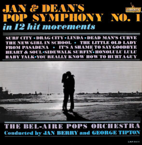
MM: Pop Symphony (May 1965) and Golden Hits Volume 2 (August 1965) featured the last Studio Five album designs for Jan & Dean. Beginning with the Folk ‘n Roll LP in November 1965 Liberty switched to in-house staff for packaging and art direction. The next five albums were designed by Woody Woodward, with photography by Ken Kim. Jan had written the liner notes for Pop Symphony, and you penned the off-kilter notes for Golden Hits Volume 2 and the photo captions for Folk ‘n Roll. Prior to these albums the liners had always been written by someone else—Bill Ballance, Roger Christian, Horace Altfeld, Shelley Fabares, or an uncredited Liberty staffer. Did Liberty initiate that change, or was it the other way around?
DT: It was the other way around.

MM: The campy Pop Art Batman television series and Jan & Dean’s pilot On the Run were both products of Twentieth Century-Fox. Batman aired on the ABC network, which also helped develop On the Run. In 1966 you designed a promotional Batman medallion featuring the classic black and yellow Bat symbol. You and Jan wore them in the photo you supplied for the cover of The Jan & Dean Record. Did you consider official merchandising at that point, with potential licensing through National Periodical Publications? I imagine it would have been a headache. Recording-wise, you could get the official DC Comics Batman art for the cover of Jan & Dean Meet Batman, but you weren’t allowed to do the album’s original comedy skits in the guise of Batman and Robin.
DT: The medallions were just for promotion, mostly for deejays. I only made maybe 250 of them. I did not want to deal with DC.


MM: The original outré concept for Filet of Soul was shelved temporarily while you and Jan worked on the Batman album in early ‘66. And then, in the days leading up to Jan’s car accident (April 12, 1966), there were skirmishes with Liberty over Filet of Soul and the release of a deep-arrangement cover of the Beatles’ non-single album cut “Norwegian Wood.” Through your studies at USC, you had been working on graphics for the Filet of Soul packaging. The post-accident released version of the album did feature some of your graphics on the back cover—but they didn’t make sense to record buyers because the original comedy concept had been nixed by Liberty. How did that come about? How were you able to finally achieve a degree of input on the design end with Liberty? Did Woody Woodward help facilitate that?
DT: I have no idea how that liner ended up being used. It didn’t match the concept. I was wanting to do a parody of the Beatles’ Rubber Soul cover. Shoot a picture of Jan & Dean with a fish-eye lens, with us in the same position as the Beatles were in, looking down at the camera. Since there were four of them, I wanted to use two photos of Jan and two photos of me. It would require some cut-and-paste and airbrushing, but it could have been done.


MM: You graduated from USC with a degree in fine arts in 1965 and then enrolled in graduate school. What was your specific grad-level area of study? I know you wrote your master’s thesis on the history of flight—which led to the naming of your design company, Kittyhawk Graphics.
DT: I only finished one semester in grad school. Jan was in the hospital and it was obvious that he was never going to fully recover, so I thought I should finish the semester and then start figuring out what to do next.

MM: Let’s take stock of where things stood on the eve of Jan’s car accident. Jan had established his production company Berry Enterprises, Ltd. in August 1965. And in early ’66 he was laying the groundwork for your own label, J&D Records. He wanted business autonomy. But in order to move forward commercially with these new business ventures, Jan would have had to somehow terminate his contracts with Screen Gems—no easy feat, as he had learned over the past couple of years—or wait until his obligations were fully met. His frustration level was at an all-time high. What do you remember about that struggle? With J&D Records you could have been free to record and design everything on your own terms. The sky would have been the limit in terms of product and packaging.
DT: No shit! I don’t remember being all that stressed about Screen Gems, but Jan was. We could prove they defrauded us, and we could take them to court and win a big-time lawsuit, and recover millions, and get our masters back at the same time. The key to this? Lou Adler. He had worked for Nevins-Kirshner previously [Screen Gems acquired Nevins-Kirshner in April 1963], and he had documentation showing that Nevins-Kirshner purposely gave their best songs to other artists first, and what was left over was given to us. The only reason we signed with them in the first place was having access to their brilliant songwriters. They promised to write hits for us, but they gave us the rejects. Luckily for us we met Brian Wilson, who helped us to write songs. Lou Adler said he would testify in court that he was told to give the best material to other artists first, and what was left over he could give to us. Game, Set, Match.
MM: Yeah, Jan was signed to Nevins-Kirshner as a songwriter and producer in September 1961. By ’64, a year after the acquisition, Jan had become disillusioned with Screen Gems. By the time of his 1966 car accident he had been fighting to get out from under the company’s thumb, legally, for the past two years. It’s well documented. And of course when Jan signed with Screen Gems, he became one of their most successful songwriters and producers in ’63 and ’64. The company publicly acknowledged Jan—and Lou Adler as head of the West Coast Office—in prominent public ads in industry rags like Cash Box. Jan was just on the cusp of getting his professional life where he wanted it to be when the accident ended everything.
Dean Torrence co-founded Jan & Dean with Jan Berry in 1959. Dean is a Grammy Award-winning graphic artist and the author of Surf City: The Jan & Dean Story (SelectBooks, 2016).

Dean won a Grammy Award for Best Album Cover for the 1971 album Pollution, by the band of the same name. Dean served as art director with photography by Gene Brownell (14th Annual Grammy Awards, 1972). The previous year Dean and Bill McEuen received a Grammy nomination for their design for the 1970 album Uncle Charlie & His Dog Teddy, by The Nitty Gritty Dirt Band (13th Annual Grammy Awards, 1971). Torrence and McEuen were nominated a second time for the Dirt Band’s 1975 album Symphonion Dream (18th Annual Grammy Awards, 1976).


You really know how to interview a guy!
Great, thorough, and most informative work, Mark
…as always.
Thank you Mark and Dean for taking time to detail some of the important Jan & Dean history … which the Rock & Roll Hall Of Fame hopefully will need one day❗️
FYI ~ Dean gave me a great interview when his book was released; more cool stories.
Phil
PrayForSurfBlog.blogspot.com
As Always Mark. Well done. Great article. Glad Dean is still Around to give his input.
You have made myself and many other Jan & Dean fans pleased and satisfied With their Story. Thank You
Great read. Thanks Mark!